CSS Horizontal Navigation Bar
Horizontal Navigation Bar
There are two ways to create a horizontal navigation bar. Using inline or floating list items.
Inline List Items
One way to build a horizontal navigation bar is to specify the <li> elements as inline, in addition to the "standard" code from the previous page:
Example
li {
  display: inline;
}
Example explained:
display: inline;- By default, <li> elements are block elements. Here, we remove the line breaks before and after each list item, to display them on one line
Floating List Items
Another way of creating a horizontal navigation bar is to float the <li> elements, and specify a layout for the navigation links:
Example
li {
  float: left;
}

a {
  display: block;
  padding: 8px;
  background-color: #dddddd;
}
Example explained:
float: left;- Use float to get block elements to float next to each otherdisplay: block;- Allows us to specify padding (and height, width, margins, etc. if you want)padding: 8px;- Specify some padding between each <a> element, to make them look goodbackground-color: #dddddd;- Add a gray background-color to each <a> element
Tip: Add the background-color to <ul> instead of each <a> element if you want a full-width background color:
Example
ul {
  background-color: #dddddd;
}
Horizontal Navigation Bar Examples
Create a basic horizontal navigation bar with a dark background color and change the background color of the links when the user moves the mouse over them:
Example
ul {
  list-style-type: none;
  margin: 0;
  padding: 0;
  overflow: hidden;
  background-color: #333;
}

li {
  float: left;
}

li a {
  display: block;
  color: white;
  text-align: center;
  padding: 14px 16px;
  text-decoration: none;
}

/* Change the link color to #111 (black) on hover */
li a:hover {
  background-color: #111;
}
Active/Current Navigation Link
Add an "active" class to the current link to let the user know which page he/she is on:
Example
.active {
  background-color: #04AA6D;
}
Right-Align Links
Right-align links by floating the list items to the right (float:right;):
Example
<ul>
  <li><a href="#home">Home</a></li>
  <li><a href="#news">News</a></li>
  <li><a href="#contact">Contact</a></li>
  <li style="float:right"><a class="active" href="#about">About</a></li>
</ul>
Border Dividers
Add the border-right property to <li> to create link dividers:
Example
/* Add a gray right border to all list items, except the last item (last-child) */
li {
  border-right: 1px solid #bbb;
}

li:last-child {
  border-right: none;
}
Fixed Navigation Bar
Make the navigation bar stay at the top or the bottom of the page, even when the user scrolls the page:
Fixed Top
ul {
  position: fixed;
  top: 0;
  width: 100%;
}
Fixed Bottom
ul {
  position: fixed;
  bottom: 0;
  width: 100%;
}
Note: Fixed position might not work properly on mobile devices.
Gray Horizontal Navbar
An example of a gray horizontal navigation bar with a thin gray border:
Example
ul {
  border: 1px solid #e7e7e7;
  background-color: #f3f3f3;
}

li a {
  color: #666;
}
Sticky Navbar
Add position: sticky; to <ul> to create a sticky navbar.
A sticky element toggles between relative and fixed, depending on the scroll position. It is positioned relative until a given offset position is met in the viewport - then it "sticks" in place (like position:fixed).
Example
ul {
  position: -webkit-sticky; /* Safari */
  position: sticky;
  top: 0;
}
Note: Internet Explorer do not support sticky positioning. Safari requires a -webkit- prefix (see example above). You must also specify at least one of top, right, bottom or left for sticky positioning to work.
More Examples
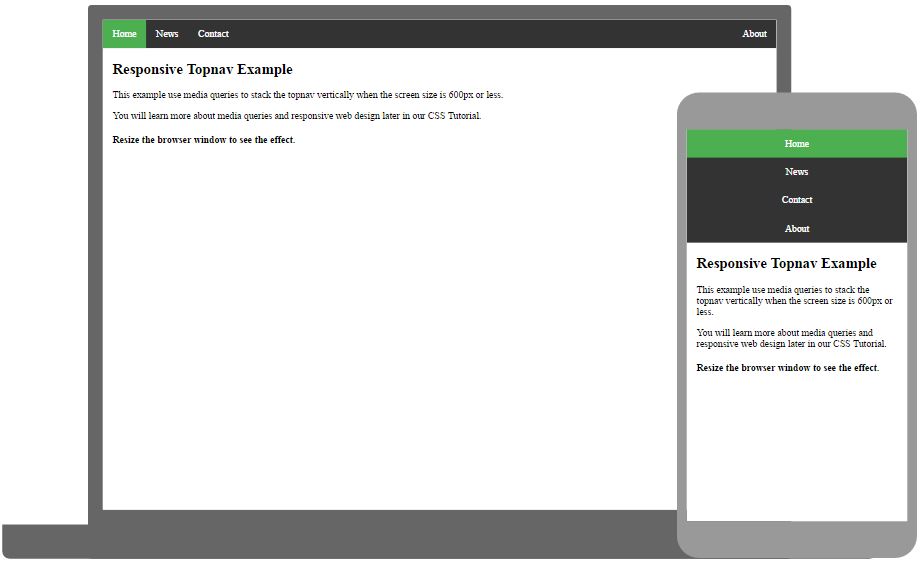
Responsive Topnav
How to use CSS media queries to create a responsive top navigation.
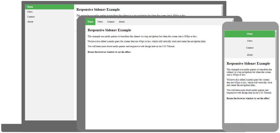
Responsive Sidenav
How to use CSS media queries to create a responsive side navigation.
Dropdown Navbar
How to add a dropdown menu inside a navigation bar.